
BRANDING
ART DIRECTION
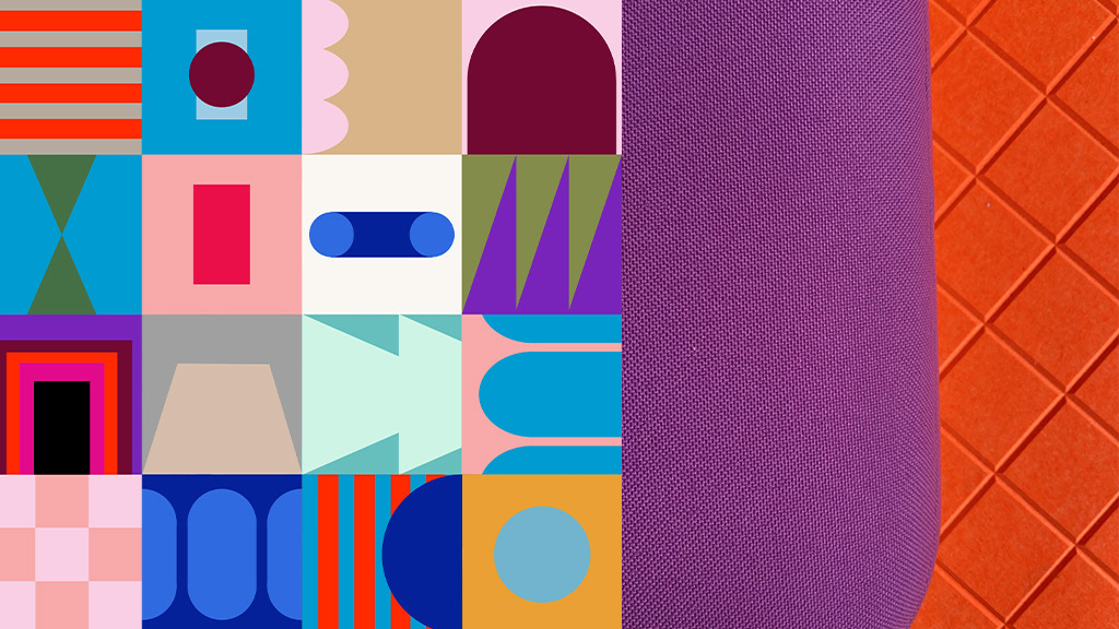
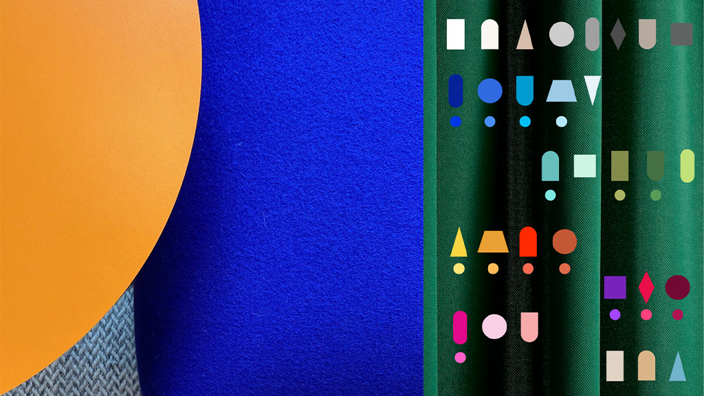
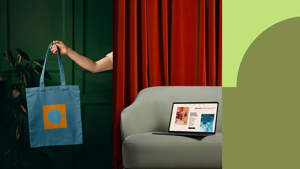
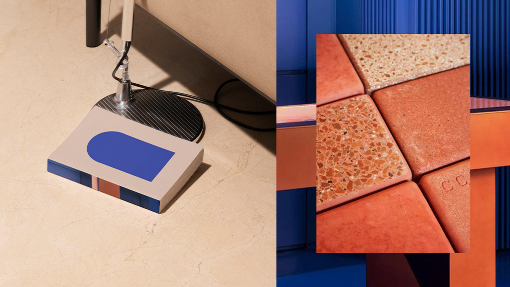
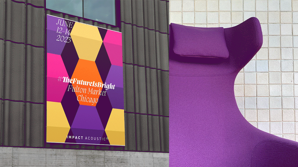
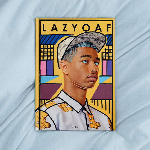
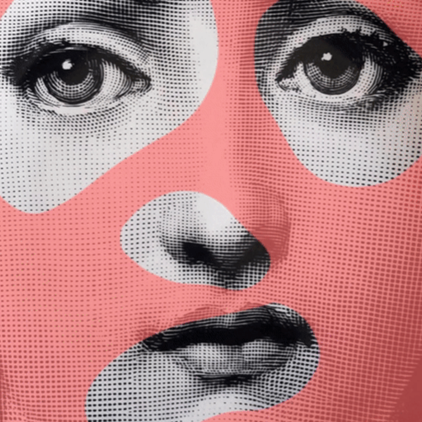
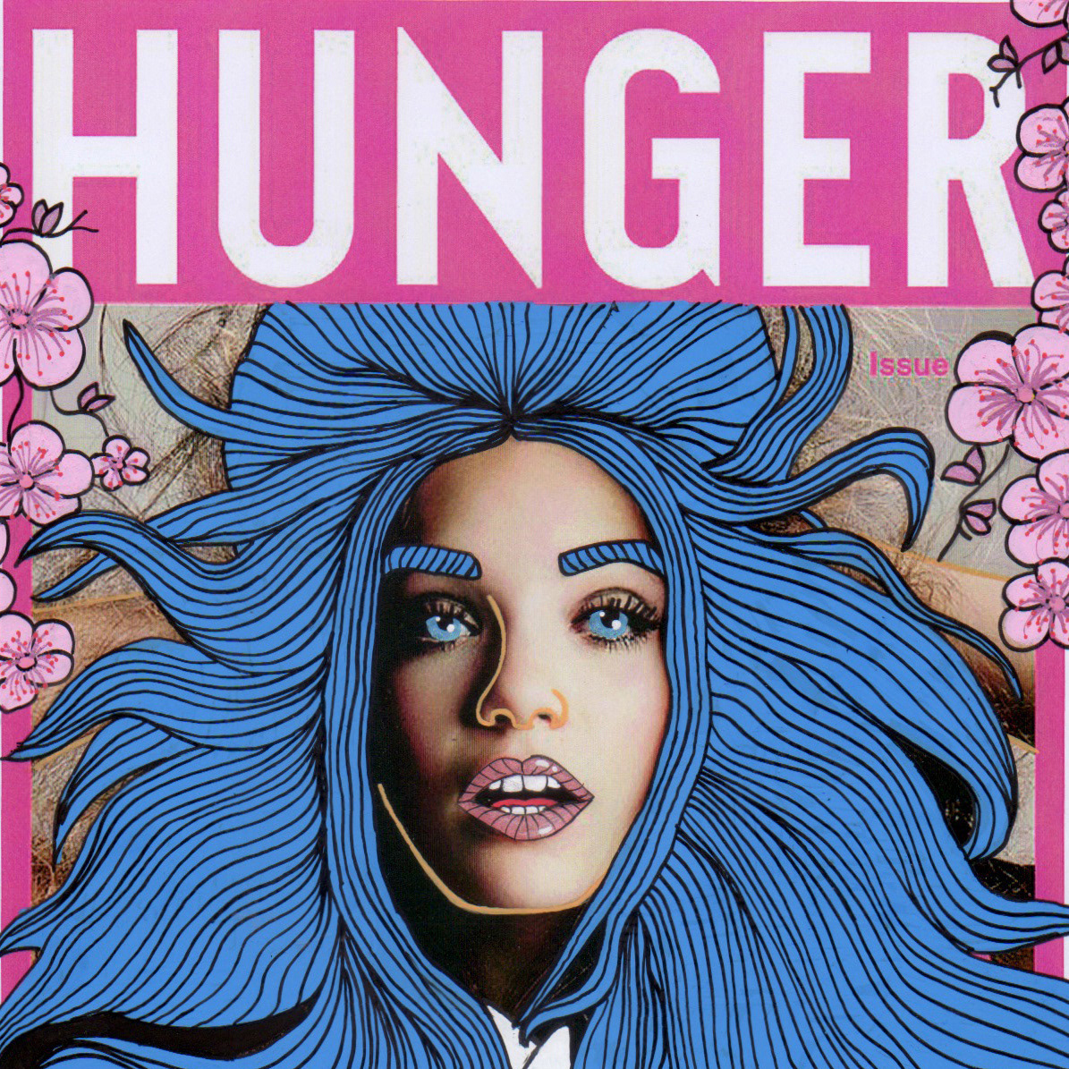
With Impact Acoustic, the inspiration came from the brand, reversing a bit the usual process, as is always the case with rebel brands. Shapes and colors, which are already an essential part of the brand’s visual identity, must be highlighted and incorporated into the visual communication. By recombining and digesting all the elements already present within the visual core of the brand, the resulting aesthetic is strongly inspired by Bauhaus and Simultaneism, in a way that I would say is neoclassical and pop. Lines, curves, arcs, draperies, harmonious contrasts of colors and shapes, minimal but not essential or aseptic environments. Photos and illustrations included across branded content reinforced the same look and feel as the rest of the elements. Whether we use photography or graphics everything evoke the brand’s personality and values.